Child elements not draggable ,droppable highlightable. also the CSS of all child elements not pushed in style section while develop a banner component in as plugin
In your model component definition, you're using content: config.template but it should be components: config.template
Read full answer below ↓Question
Hello @artf ,
I am trying to develop a simple banner plugin which will be include a heading , subheading and link. and every element can be draggable ,droppable highlightable, but based on below code some portion of code not working. Please Help

only banner class CSS pushed but another all not go in the CSS section
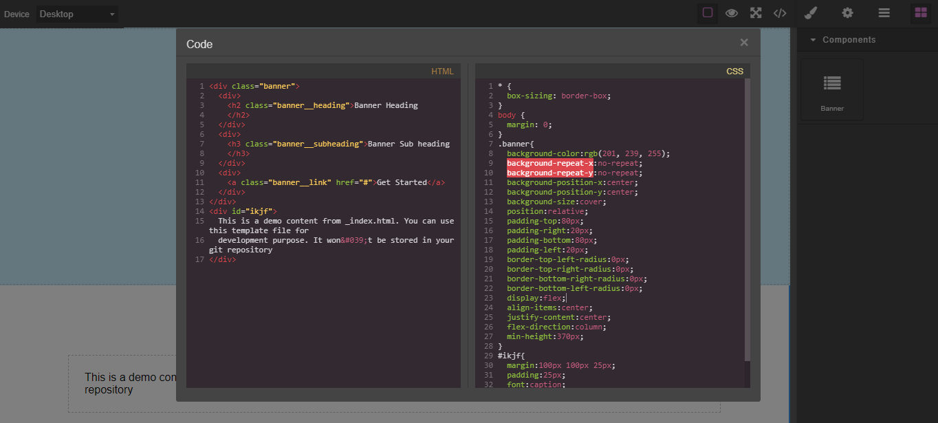
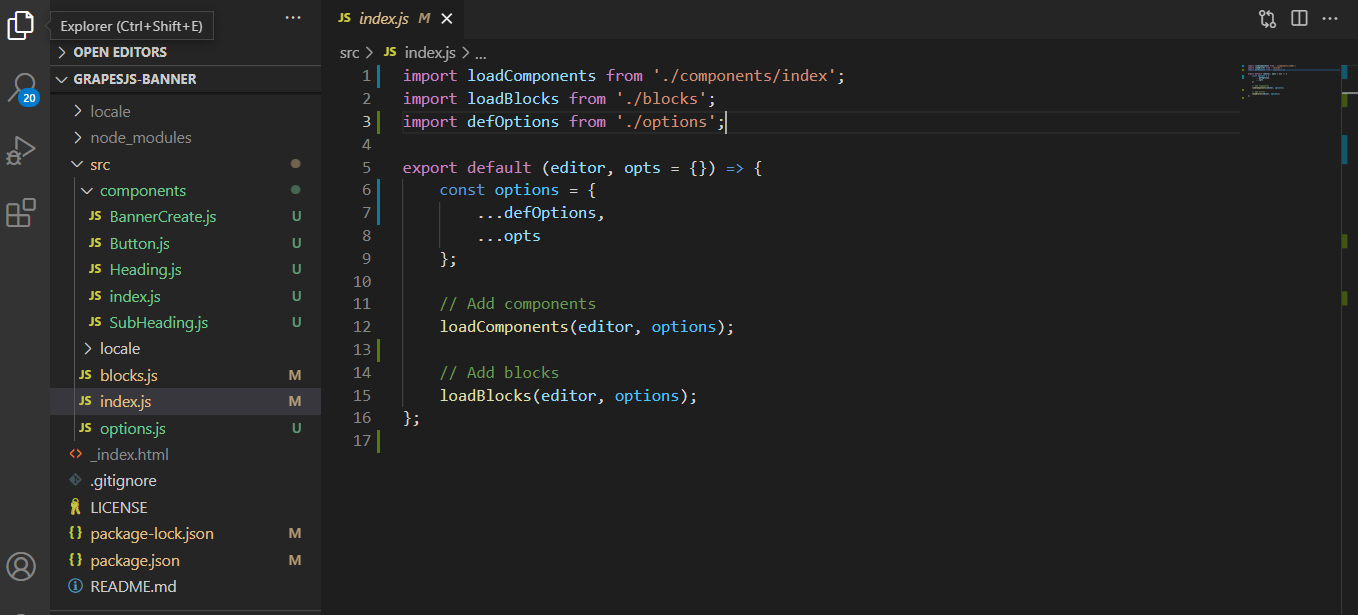
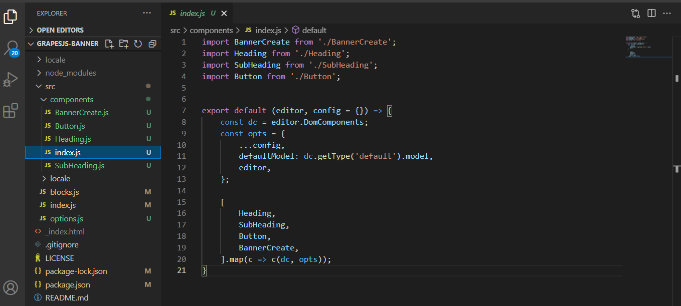
------------ index.js----------

import loadComponents from './components';
import loadBlocks from './blocks';
export default (editor, opts = {}) => {
const options = {... {
// default options
bannerBlock: {},
classBanner: "banner",
template: `
<div><h2 class="banner__heading">Banner Heading</h2></div>
<div> <h3 class="banner__subheading">Banner Sub heading</h3></div>
<div> <a class="banner__link" href="#">Get Started</a></div>
`,
style: `
.banner {
background-color: #c9efff;
background-repeat: no-repeat;
background-position: center center;
background-size: cover;
position: relative;
padding: 80px 20px;
border-radius:0;
display: flex;
align-items: center;
justify-content: center;
flex-direction: column;
min-height: 370px;
}
.banner__heading {
font-weight: 700;
color: #333;
font-size: 40px;
margin-bottom: 16px;
text-align: center;
line-height: 1.2;
}
.banner__subheading {
font-size: 26px;
text-align: center;
margin-top: 16px;
font-weight: 500;
color: #333;
}
.banner__link {
display: block;
padding: 10px 20px;
background: none;
margin: 5px;
font-size: 14px;
color: #fff !important;
background-color: #005A9E;
transition: all 0.2s ease-in;
border-radius: 4px;
font-weight: 500;
border: none !important;
text-align: center;
min-width: 160px;
letter-spacing: 1px;
}
`,
},
...opts
};
// Add components
loadComponents(editor, options);
// Add blocks
loadBlocks(editor, options);
};
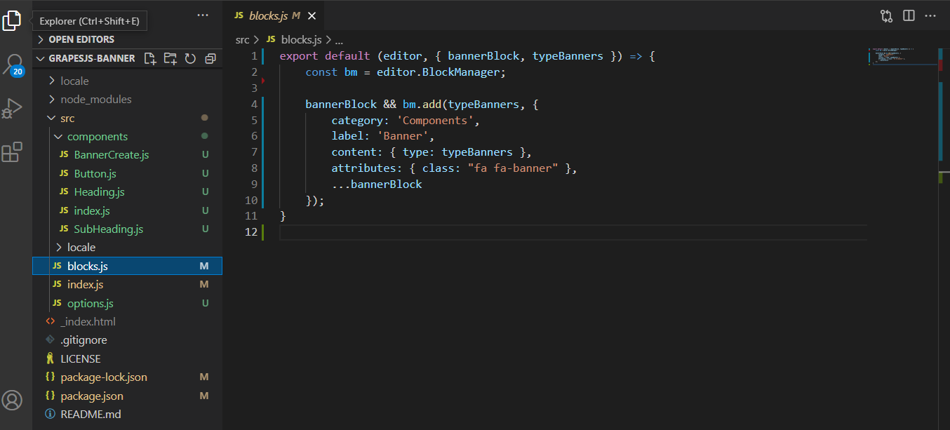
------------- Block JS-------------
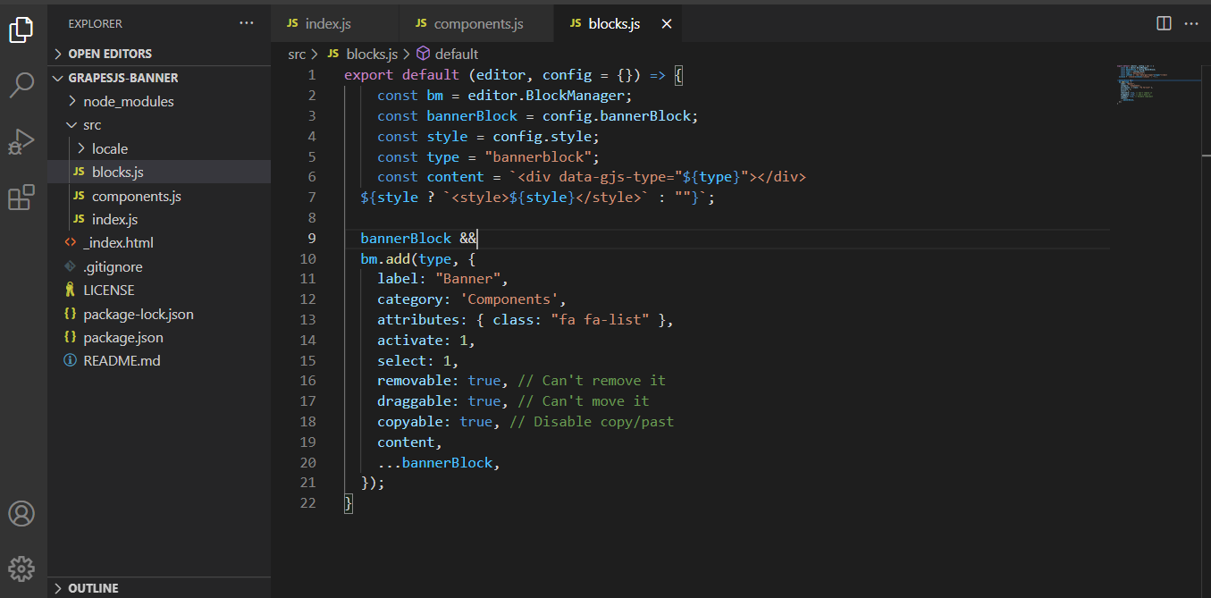
export default (editor, config = {}) => {
const bm = editor.BlockManager;
const bannerBlock = config.bannerBlock;
const style = config.style;
const type = "bannerblock";
const content = `<div data-gjs-type="${type}"></div>
${style ? `<style>${style}</style>` : ""}`;
bannerBlock &&
bm.add(type, {
label: "Banner",
category: 'Components',
attributes: { class: "fa fa-list" },
activate: 1,
select: 1,
removable: true, // Can't remove it
draggable: true, // Can't move it
copyable: true, // Disable copy/past
content,
...bannerBlock,
});
}
----------- Component JS------------
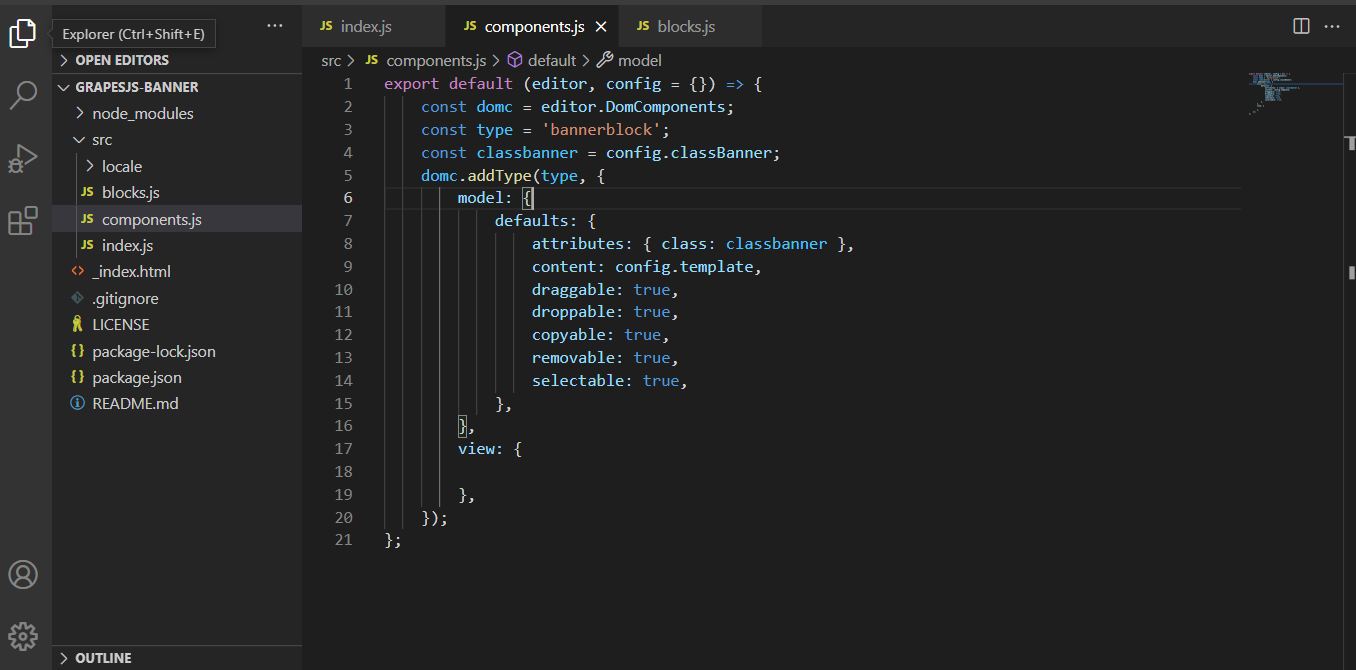
export default (editor, config = {}) => {
const domc = editor.DomComponents;
const type = 'bannerblock';
const classbanner = config.classBanner;
domc.addType(type, {
model: {
defaults: {
attributes: { class: classbanner },
content: config.template,
draggable: true,
droppable: true,
copyable: true,
removable: true,
selectable: true,
},
},
view: {
},
});
};Answers (3)
In your model component definition, you're using content: config.template but it should be components: config.template
Hello @artf ,
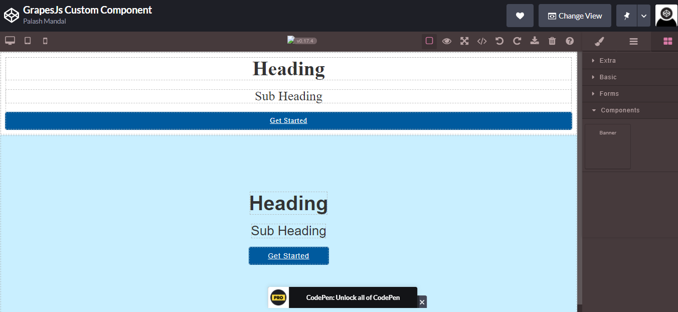
I have made the solution but there are some issue arise the component. the child component h2,h3 and link pushed for all other component. If I drop one column component those child element also pushed inside there. How Do I restrict the conflict. Below here is the codepen example where I made a demo. https://codepen.io/coderdesigners/full/XWMoNbZ
If I drop one column the below com up. which is not expected. it should as per default.
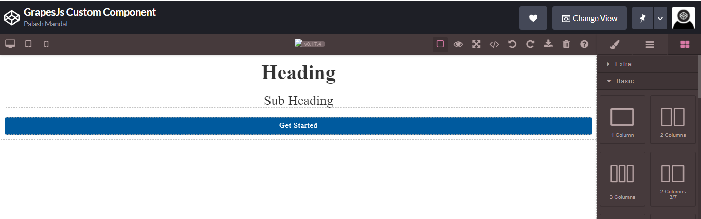
When drop the banner component.
Please Please help this. I know I have some silly mistake which is I unable to under stand. I am sorry for bother you.
Thanks in Advance.
And here is my plugin details
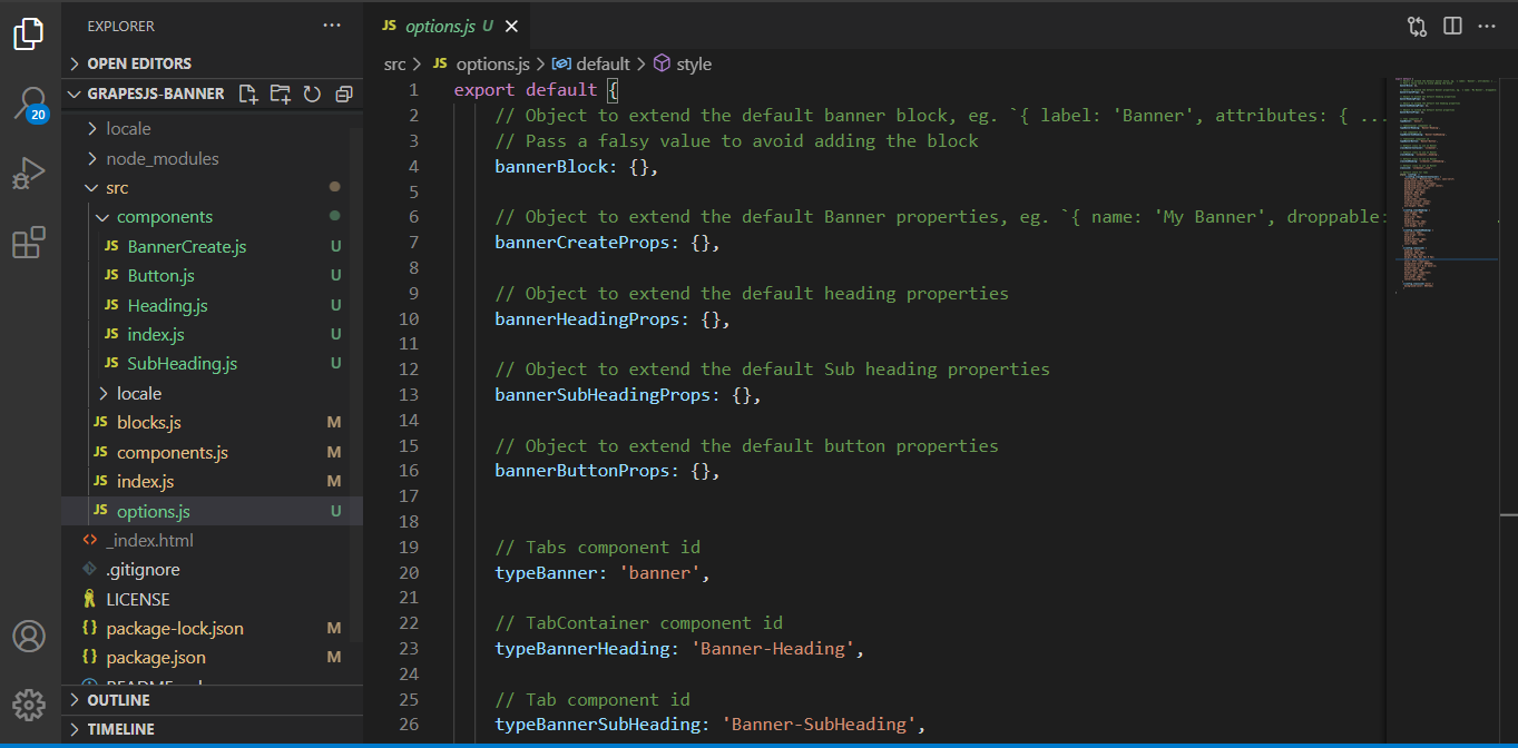 export default {
// Object to extend the default banner block, eg.
export default {
// Object to extend the default banner block, eg. { label: 'Banner', attributes: { ... } }
// Pass a falsy value to avoid adding the block
bannerBlock: {},
// Object to extend the default Banner properties, eg. `{ name: 'My Banner', droppable: false, ... }`
bannerCreateProps: {},

// Object to extend the default heading properties
bannerHeadingProps: {},

// Object to extend the default Sub heading properties
bannerSubHeadingProps: {},

// Object to extend the default button properties
bannerButtonProps: {},


// Tabs component id
typeBanner: 'banner',

// TabContainer component id
typeBannerHeading: 'Banner-Heading',

// Tab component id
typeBannerSubHeading: 'Banner-SubHeading',

// TabContent component id
typeBannerButton: 'Banner-Button',

// Default class to use on Banner
classBannerContainer: 'zslbanner',

// Default class to use on Banner
classHeading: 'zslbanner__heading',
// Default class to use on Banner
classSubHeading: 'zslbanner__subheading',
// Default class to use on Banner
classLink: 'zslbanner__link',
// Default style for tabs
style: (config) => `
.${config.classBannerContainer} {
font-family: 'Montserrat', Arial, sans-serif;
background-color: #c9efff;
background-repeat: no-repeat;
background-position: center center;
background-size: cover;
position: relative;
padding: 80px 20px;
border-radius:0;
display: flex;
align-items: center;
justify-content: center;
flex-direction: column;
min-height: 370px;
}
.${config.classHeading} {
font-weight: 700;
color: #333;
font-size: 40px;
margin:0;
margin-bottom: 16px;
text-align: center;
line-height: 1.2;
}
.${config.classSubHeading} {
font-size: 26px;
text-align: center;
margin:0;
margin-bottom: 16px;
font-weight: 500;
color: #333;
}
.${config.classLink} {
display: block;
padding: 10px 20px;
background: none;
margin: 20px 5px 5px 0 5px;
font-size: 14px;
color: #fff !important;
background-color: #005A9E;
transition: all 0.2s ease-in;
border-radius: 4px;
font-weight: 500;
border: none !important;
text-align: center;
min-width: 160px;
letter-spacing: 1px;
}
.${config.classLink}:hover {
background-color: #037ede;
}
`
}
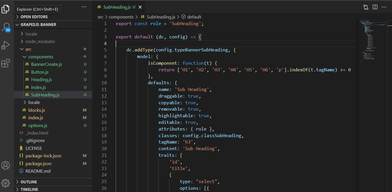
**Subheading.js**
export const role = 'SubHeading';
export default (dc, config) => {
dc.addType(config.typeBannerSubHeading, {
model: {
isComponent: function(t) {
return ['H1', 'H2', 'H3', 'H4', 'H5', 'H6', 'p'].indexOf(t.tagName) >= 0
},
defaults: {
name: 'Sub Heading',
draggable: true,
copyable: true,
removable: true,
highlightable: true,
editable: true,
attributes: { role },
classes: config.classSubHeading,
tagName: 'h3',
content: 'Sub Heading',
traits: [
'id',
'title',
{
type: "select",
options: [{
value: "h1",
name: "Heading 1"
}, {
value: "h2",
name: "Heading 2"
}, {
value: "h3",
name: "Heading 3"
}, {
value: "h4",
name: "Heading 4"
}, {
value: "h5",
name: "Heading 5"
}, {
value: "h6",
name: "Heading 6"
}, {
value: "p",
name: "Paragraph"
}],
label: "Heading Or paragraph",
name: "tagName",
changeProp: 1
}
],
...config.bannerSubHeadingProps
},
},
view: {
events: {
dblclick: 'onActive',
focusout: 'onDisable',
},
onActive() {
this.el.contentEditable = true;
},
onDisable() {
const { el, model } = this;
// el.contentEditable = false;
model.set('content', el.innerHTML)
},
}
});
}
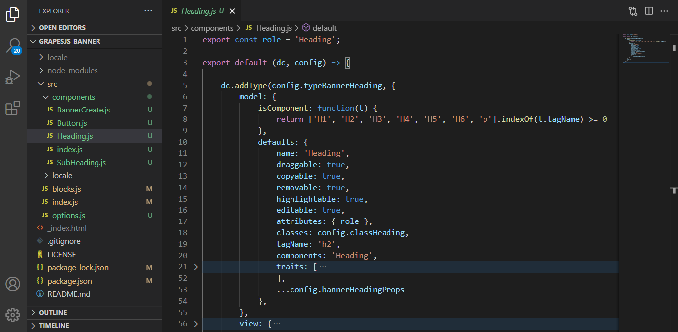
**Heading.js**
export const role = 'Heading';
export default (dc, config) => {
dc.addType(config.typeBannerHeading, {
model: {
isComponent: function(t) {
return ['H1', 'H2', 'H3', 'H4', 'H5', 'H6', 'p'].indexOf(t.tagName) >= 0
},
defaults: {
name: 'Heading',
draggable: true,
copyable: true,
removable: true,
highlightable: true,
editable: true,
attributes: { role },
classes: config.classHeading,
tagName: 'h2',
components: 'Heading',
traits: [
'id',
'title',
{
type: "select",
options: [{
value: "h1",
name: "Heading 1"
}, {
value: "h2",
name: "Heading 2"
}, {
value: "h3",
name: "Heading 3"
}, {
value: "h4",
name: "Heading 4"
}, {
value: "h5",
name: "Heading 5"
}, {
value: "h6",
name: "Heading 6"
}, {
value: "p",
name: "Paragraph"
}],
label: "Heading Or paragraph",
name: "tagName",
changeProp: 1
}
],
...config.bannerHeadingProps
},
},
view: {
events: {
dblclick: 'onActive',
focusout: 'onDisable',
},
onActive() {
this.el.contentEditable = true;
},
onDisable() {
const { el, model } = this;
el.contentEditable = false;
model.set('content', el.innerHTML)
},
}
});
}
**Button.js**
export default (dc, config) => {
dc.addType(config.typeBannerButton, {
model: {
extend: 'link',
defaults: {
editable: true,
name: 'Button',
draggable: true,
copyable: true,
removable: true,
highlightable: true,
attributes: {
href: '#'
},
classes: config.classLink,
content: 'Get Started',
tagName: 'a',
traits: [
'id',
'title',
'href',
'target',
],
...config.bannerButtonProps
},
},
view: {
events: {
dblclick: 'onActive',
focusout: 'onDisable',
},
onActive() {
this.el.contentEditable = true;
},
onDisable() {
const { el, model } = this;
el.contentEditable = false;
model.set('content', el.innerHTML)
},
}
});
}
**BannerCreate.js**
export default (dc, {
typeBanner,
typeBannerHeading,
typeBannerSubHeading,
typeBannerButton,
style,
...config
}) => {
const type = config.typeBanner;
dc.addType(type, {
model: {
defaults: {
name: 'Banner',
classes: config.classBannerContainer,
components: [
{ type: typeBannerHeading },
{ type: typeBannerSubHeading },
{ type: typeBannerButton },
style && `<style>${style(config)}</style>`
],
...config.bannerCreateProps
},
},
});
}
Please Help.Thanks for reporting this, @Palash-Mandal.
Great question about Child elements not draggable ,droppable highlightable. also the CSS of all child elements not pushed in style section while develop a banner component in as plugin. The recommended approach with ProseMirror is to use the event-driven API.
Start here:
- Check the GrapesJS documentation for your specific module
- Look for the
on()event listener method - Most operations can be achieved by listening to editor and component events
Common patterns:
// Listen for changes
editor.on('change', () => console.log('something changed'));

// Component lifecycle
editor.on('component:mount', (c) => console.log('component ready', c));
editor.on('component:update', (c) => console.log('component updated', c));
If you're still stuck:
- Share a minimal CodeSandbox reproduction
- Include what you've already tried
- Mention your GrapesJS version
- The community is here to help!
Related Questions and Answers
Continue research with similar issue discussions.
Issue #3116
[HELP WANTED] How to load css that can viewed in code viewer and also exported while saving
Hi :wave: I am trying to load some CSS within the editor as part of the theme, I am able to link stylesheets as part of loading but the pro...
Issue #4191
We are trying to store the data from grapesJS editor in Angular 10 application, getting CORS error, image attached below
GrapesJS version [x] I confirm to use the latest version of GrapesJS What browser are you using? Chrome 99.0.4844.5 Reproducible demo link...
Issue #4752
Component with pointer-events: 'all' (except wrapper) or editable component are draggable & droppable to itself.
GrapesJS version[X] I confirm to use the latest version of GrapesJSWhat browser are you using? Chrome 107.0.5304.121 (Official Build) (arm6...
Issue #3137
When I select an particular element I'm not getting its styles. This issue happens only with some elements.
Not getting styles of the selected element Here is my code, const model = editor.StyleManager.getModelToStyle(component); let styleObject =...
Paid Plugins That Match This Issue
Curated by issue keywords and label relevance to help you ship faster.
Loading paid plugin recommendations...
Check the open-source GrapesJS plugins on GitHub or run a quick search in our free catalog.
Browse free plugins →Premium plugins ship with support, regular updates, and production-ready features — save days of integration work.
Browse premium plugins →Related tutorials
In-depth guides on the same topic.
Tutorial
How to Build a Production GrapesJS Editor: The Complete Walkthrough of Brief, Preset, Plugins, and Services
A complete walkthrough of building a production GrapesJS editor: how to choose a preset, pick plugins, and scope setup services without burning a sprint.
Tutorial
Embed GrapesJS in Your SaaS: A Weekend Guide
Embed GrapesJS in your SaaS and ship a white-label page builder over a weekend. Honest tradeoffs, real code, and the plugins that close the UX gap.
Tutorial
Big Updates: TinyMCE 8 and Placeholder 2.0 for GrapesJS
In May we shipped major updates to two of our most popular GrapesJS plugins — TinyMCE Inline Text Editor and Placeholder.
Browse Plugin Categories
Jump directly to plugin category pages on the marketplace.