Media Query
Yes, just choose Device from top left and change the style. You can add custom breakpoint too, check API-Device-Manager page.
Read full answer below ↓Question
Is there any way to apply css on specific width like (max-width:767px) so that we can make template responsive???
Answers (3)
Yes, just choose Device from top left
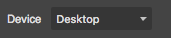 and change the style.
You can add custom breakpoint too, check API-Device-Manager page.
Ok thanks for the message
This thread has been automatically locked since there has not been any recent activity after it was closed. Please open a new issue for related bugs.
Related Questions and Answers
Continue research with similar issue discussions.
Issue #1336
[Question] Can I make everything unselectable by default?
Currently all components are selectable/hoverable by default. And if you want you can change that behavior by providing data-gjs-hoverable=...
Issue #501
Add custom CSS rule
Hi! I would like to add a CSS rule that, for instance, changes appearance of a component based on some attribute. I.e. Is there a way of do...
Issue #1506
Css Media Query Issue
Hello @artf There is an issue on demo page as well as library in media query. Issue is that if user update style on mobile view first and t...
Issue #1766
Is There any way to integrate ImageEditor in GrapesJs
After Dropping the image inside the editor is there any plugin for GrapesJs to edit that image like Cropping , adding text on it .....
Paid Plugins That Match This Issue
Curated by issue keywords and label relevance to help you ship faster.
Loading paid plugin recommendations...
Check the open-source GrapesJS plugins on GitHub or run a quick search in our free catalog.
Browse free plugins →Premium plugins ship with support, regular updates, and production-ready features — save days of integration work.
Browse premium plugins →Related tutorials
In-depth guides on the same topic.
Browse Plugin Categories
Jump directly to plugin category pages on the marketplace.