Option for responsive design
@micker If I'm understanding you correctly, then this is already implemented, when you change the styles of a component on a given device, a media query will be used. You can see that on the demo page: https://grapesjs.com/demo.html You can change the device to mobile, change the width of something and go back to desk...
Read full answer below ↓Question
hello i am not sure its not already implement but i didn't find where
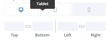
=> with grap we can change display for check responsive option but we can't change option for specific device ?
like change size of block on smartphone
exemple
 what do you think about this ?
Answers (3)
@micker If I'm understanding you correctly, then this is already implemented, when you change the styles of a component on a given device, a media query will be used. You can see that on the demo page: https://grapesjs.com/demo.html You can change the device to mobile, change the width of something...
Ah cool
@MartinPutz I have implemented the responsive feature as shown in the getting started guide but when I click on the mobile icon, the layout is only squished. (The two-column layout does not change to two-row. Only the width is reduced) Can you pls help me if you have worked on the responsive design?
Related Questions and Answers
Continue research with similar issue discussions.
Issue #3040
Mouse over text on Style Manger items
What are you trying to add to GrapesJS? Hi. Not sure if this is already baked in but: Is it possible to change the mouse over text on a cus...
Issue #1044
Change src for image element in model
hello when a image block drop to editor i hide the default asset manager and display my custom asset manager: fot this i have no problem.bu...
Issue #3123
Add 'inline-flex' to display selector in Style Manager
What are you trying to add to GrapesJS? Display style inline-flex. Description: Currently the display selector of the Style Manager has onl...
Issue #3328
How can I update the nodeValue (text value) of components by inputs forms
Hello. Grapesjs is a great tool. Thanks for it. I want to update the text value of a component by inputs, how can I do that?? if a user fil...
Paid Plugins That Match This Issue
Curated by issue keywords and label relevance to help you ship faster.
Loading paid plugin recommendations...
Check the open-source GrapesJS plugins on GitHub or run a quick search in our free catalog.
Browse free plugins →Premium plugins ship with support, regular updates, and production-ready features — save days of integration work.
Browse premium plugins →Browse Plugin Categories
Jump directly to plugin category pages on the marketplace.