Mobile device view is not working well.
@Excellent-Developer what exactly is the problem in the UI? If you're suggesting that the button for the device selection don't have the resolutions you need,then you can change that from the config file inside editor forlder. If you're suggesting that the UI inside the canvas is not auto-aligned according to the smal...
Read full answer below ↓Question
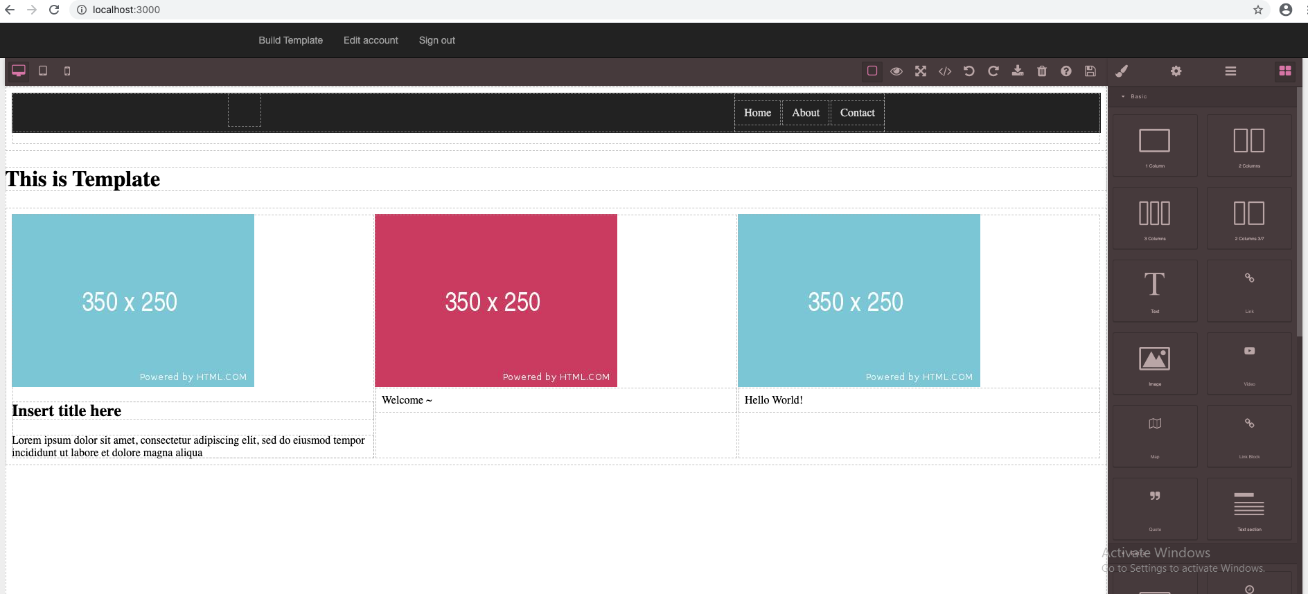 This is for Desktop
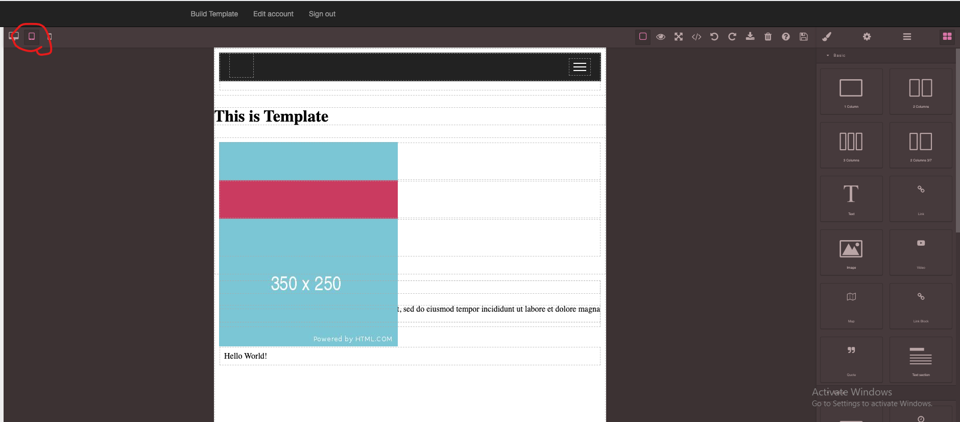 This is for Mobile
Please teach me how to solve it.
This is for Mobile
Please teach me how to solve it.
Answers (1)
@Excellent-Developer what exactly is the problem in the UI? If you're suggesting that the button for the device selection don't have the resolutions you need,then you can change that from the config file inside editor forlder. If you're suggesting that the UI inside the canvas is not auto-aligned a...
Related Questions and Answers
Continue research with similar issue discussions.
Issue #1801
CSS in Mobile View
I have developed a Grapesjs Application in which when I switch device from desktop to mobile it gets distorted. Please Help... Desktop View...
Issue #3315
Mm or cm Units are converted to px
I realized that mm or cm units are converted to px. How can i solve this problem? Thank you
Issue #1752
Add Image is not working in IE Browser
Uploading an image and adding to the template is working in Chrome but it is not working in IE browser. Please give me a solution how to fi...
Issue #2865
Enable 'view components' button on panel by default
this button is currently off by default. so you have to turn it on every time, which is not obvious to everyone. how do you make it active...
Paid Plugins That Match This Issue
Curated by issue keywords and label relevance to help you ship faster.
Loading paid plugin recommendations...
Check the open-source GrapesJS plugins on GitHub or run a quick search in our free catalog.
Browse free plugins →Premium plugins ship with support, regular updates, and production-ready features — save days of integration work.
Browse premium plugins →Related tutorials
In-depth guides on the same topic.
Tutorial
Embed GrapesJS in Your SaaS: A Weekend Guide
Embed GrapesJS in your SaaS and ship a white-label page builder over a weekend. Honest tradeoffs, real code, and the plugins that close the UX gap.
Tutorial
GJS.Market Just Got a Major Update — Here's What's New
A new Marketplace page, curated Premium Picks, a sticky product CTA, smarter product labels, and a full mobile UX refresh — here's everything
Tutorial
10 Mistakes When Building a Visual Editor (And How to Avoid Them)
Visual editors are powerful tools — they enable non-technical users to create websites, emails, landing pages, and applications without writing code
Browse Plugin Categories
Jump directly to plugin category pages on the marketplace.