
Responsive Pack — Breakpoint Manager for GrapesJS

What's Included
- Source code package (project files)
- Production-ready dist build
- GrapesJS Studio compatible
- Commercial license
- Future updates included
GrapesJS Compatible
Tested with GrapesJS 0.23.x, 0.22.x, 0.21.x, 0.20.x, 0.19.x
Source Code Included
Full source + production-ready dist build
Studio Ready
Fully compatible with GrapesJS Studio
Commercial License
Use in client projects without restrictions
Responsive Pack — Advanced Device & Breakpoint Manager for GrapesJS
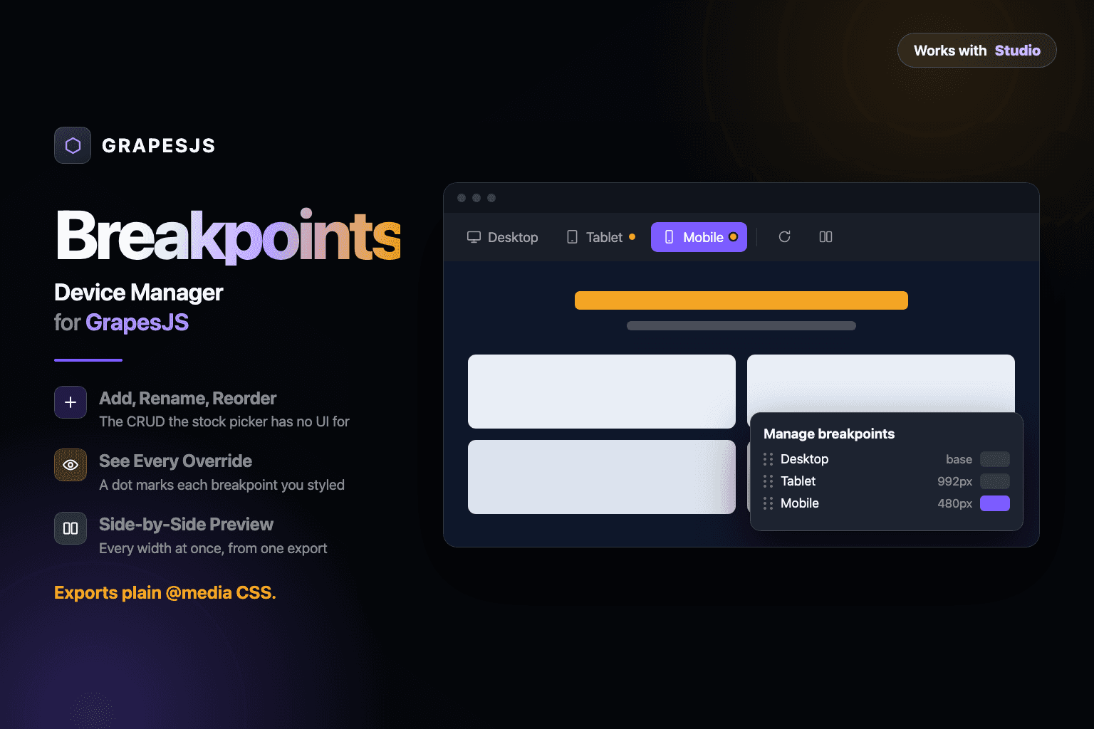
The default GrapesJS device switcher tells you which width you're editing. It doesn't tell you what's breaking at that breakpoint.
Set a font size on mobile. Add a margin on tablet. Two hours later, you're back on desktop wondering why the heading looks wrong — with no easy way to see which responsive override caused it.
Responsive Pack replaces the stock GrapesJS device manager with a complete responsive workflow built for real-world editing.
What You Get
🔴 Responsive Override Indicators
See exactly where the selected component has breakpoint-specific styles.
Small indicators next to each device show when a component has responsive overrides — so you can immediately spot mobile, tablet, or desktop-specific changes without digging through CSS.
📱 Side-by-Side Responsive Preview
Preview multiple devices simultaneously.
See mobile, tablet, and desktop side by side with synchronized scrolling. Quickly catch:
Broken layouts
Unexpected spacing
Typography changes
Overflow issues
Elements appearing or disappearing at the wrong breakpoint
No more switching between devices one by one.
⚙️ Full Breakpoint Editor
Take complete control over your responsive devices.
Add, rename, reorder, or delete devices and configure:
Width
Height
min-widthmax-widthDevice ID
Device name
Changes are written directly to editor.Devices, keeping the plugin fully integrated with the GrapesJS device system.
📐 Device Presets
Start with popular real-world screen sizes.
Includes presets for:
iPhone
iPad
MacBook
Common Android devices
Custom device sizes
Extend the preset list with your own devices whenever your project requires it.
🖥️ Device Frames & Orientation
Make responsive preview feel like testing a real device.
Preview pages inside device frames, switch between portrait and landscape, and resize the canvas freely with drag controls.
Built for Real GrapesJS Projects
Responsive Pack is especially useful for teams building GrapesJS-based editors for non-technical users.
Because users will inevitably:
Change a style on mobile and forget about it.
Instead of forcing them to understand media queries and CSS inheritance, Responsive Pack makes responsive styling visible, understandable, and easy to debug.
It's also for developers who have spent an afternoon searching through generated CSS only to discover that a single breakpoint override was responsible for the entire problem.
Why Responsive Pack?
Stock GrapesJS:
Choose a device → edit → switch device → guess what changed.
Responsive Pack:
See breakpoints → identify overrides → compare devices → fix the problem.
Responsive design shouldn't require digging through CSS.
Compatibility
GrapesJS: 0.19 – 0.23
Works with the native GrapesJS Device Manager
Responsive styles remain standard GrapesJS styles
No proprietary breakpoint system
Buy Once. Keep Updating.
One purchase includes all future updates.
Built for developers and teams shipping production-grade responsive GrapesJS editors.
Ratings:
1 reviews
Product Reviews (0)
No Reviews Found
Questions & Answers
No questions yet. Have something to ask?
Common problems this plugin can help fix
Real community questions on the same topic — see how others worked around them.